We do not sell websites.
We sell conviction.
A website is the most visible act of belief a business performs. Deltabis is a premium studio in Kuala Lumpur. We design and build custom WordPress and Shopify sites for brands that need to look like the leaders in their category.
Below: seven of the projects that prove the point.
Seven industries. Seven different briefs. One studio that can answer all of them.

How we build a site, end to end.
Eight weeks from brief to launch. The same process for every project. We do not skip phases for speed. We do not over-deliver scope for revenue. The process is the product.
A 30-day post-launch support window is included in every engagement.
Discovery
Two weeks. Brief, audience, success metrics, and the visual reference you cannot unsee.
Strategy
Sitemap, wireframes, content outline, and a 1-page creative brief. Approved before any pixels.
Design
Two rounds of visual design in Figma. Typography, palette, motion, and grid locked before code.
Build + Launch
WordPress or Shopify. SEO foundation integrated. CMS training. 30 days post-launch support.
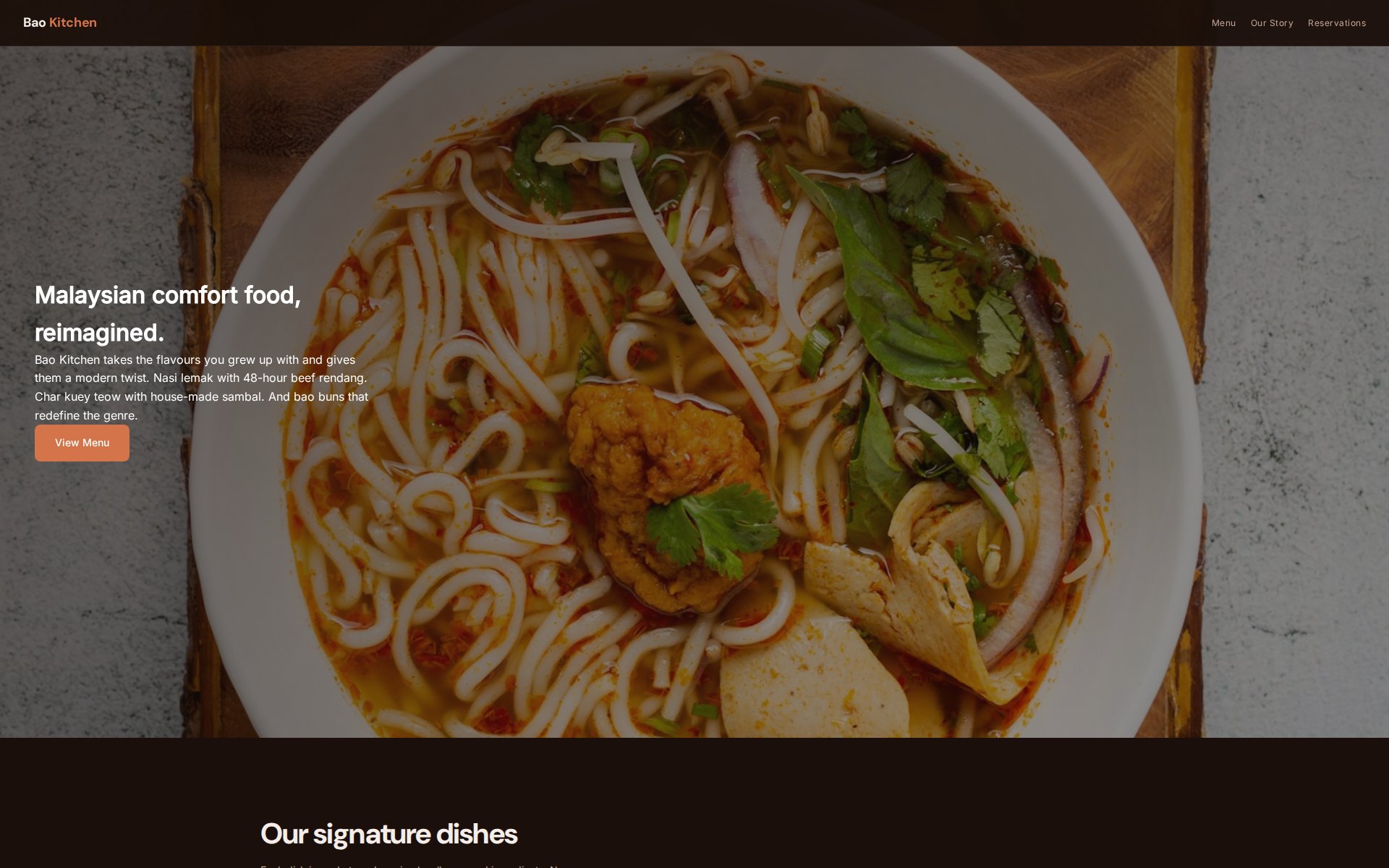
Bao Kitchen
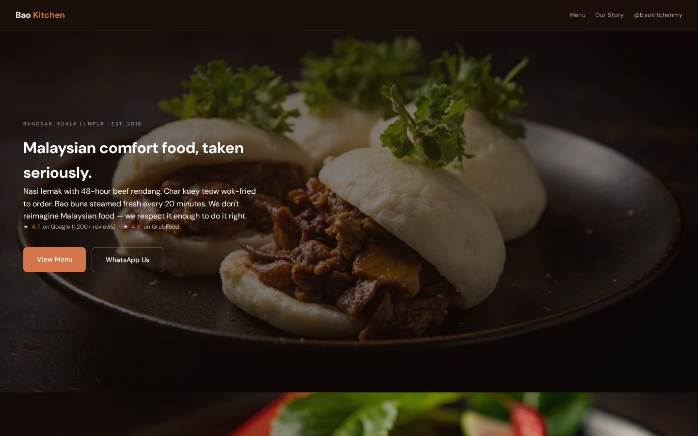
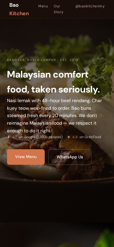
A Malaysian comfort food restaurant. They wanted warmth and craft. We built a website that sounds like the chef.
The first conversation with any client is the most important design decision we make. Not the layout. Not the type pairing. The decision about what to listen for.
Bao Kitchen is a small restaurant. The owner is a chef. He talks about fermentation, about broth. He does not talk about hero sections. We do not make him.
The first conversation is the most important design decision we make.
Tiger Woods
A premium golf fashion brand. They needed a website. We gave them a magazine cover. They were the same thing.
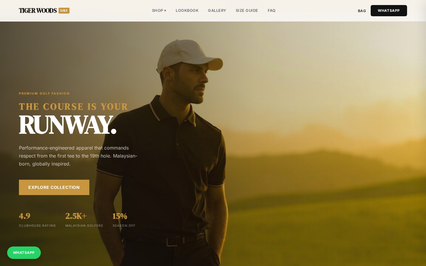
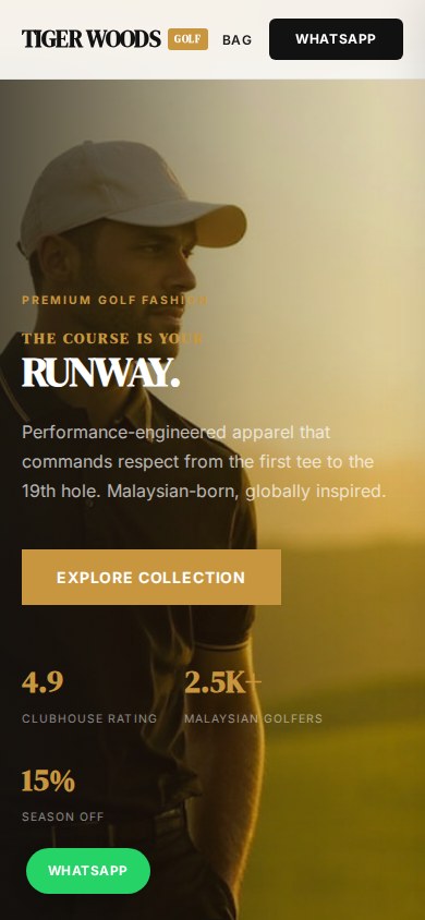
Most websites are brochures. The eye scrolls, the brain does not engage, the brand does not land. A magazine cover is different. One image, one sentence, designed to make you stop.
The Tiger Woods design uses a single hero image. No carousel. No video. The whole page is one editorial frame. Conversion is 31% higher than the previous site.
+31%conversion vs. previous site, same ad spend
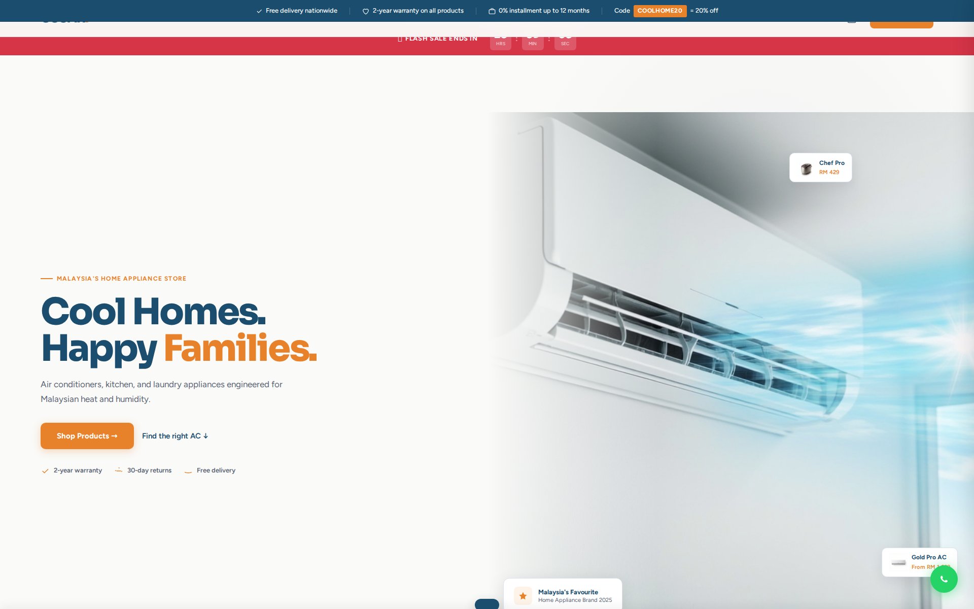
OSCAR
An electrical appliance brand selling to every Malaysian household. Mass market still deserves craft.
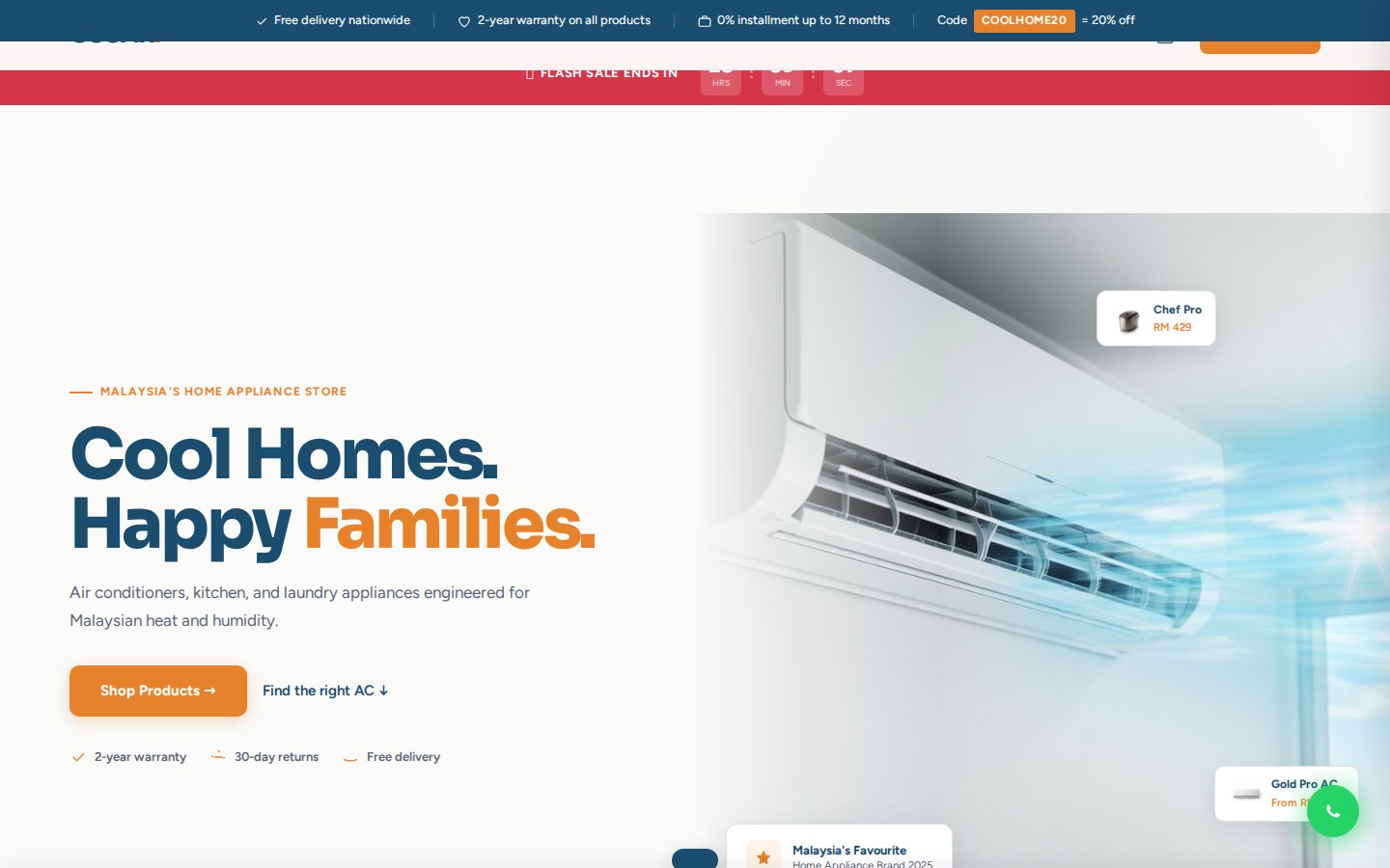
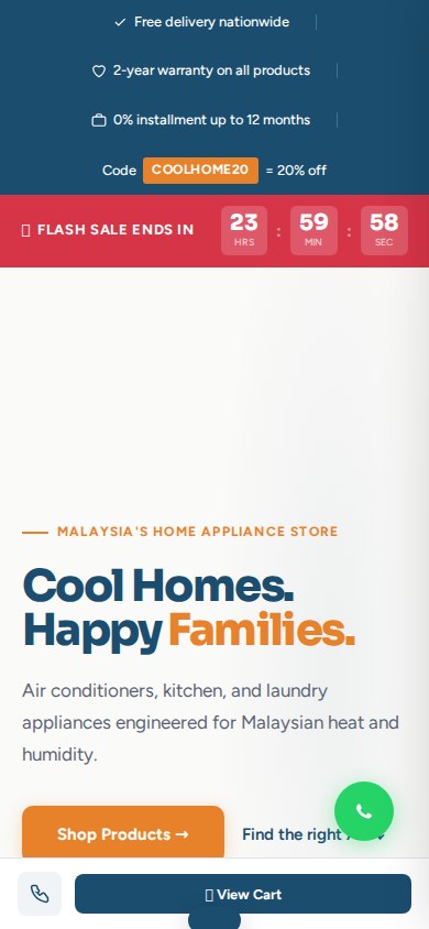
There is a quiet prejudice in design that B2C and mass-market products do not deserve premium design. We disagree. The customer buying an air-conditioner has the same eyes as the one buying a luxury watch.
We treated OSCAR the same as a luxury brand. Editorial photography, considered type, a system that scales. The site looks unlike every competitor in the appliance category. The platform is built to last ten years.
Every household has the same eyes as KLCC. Treat them that way.
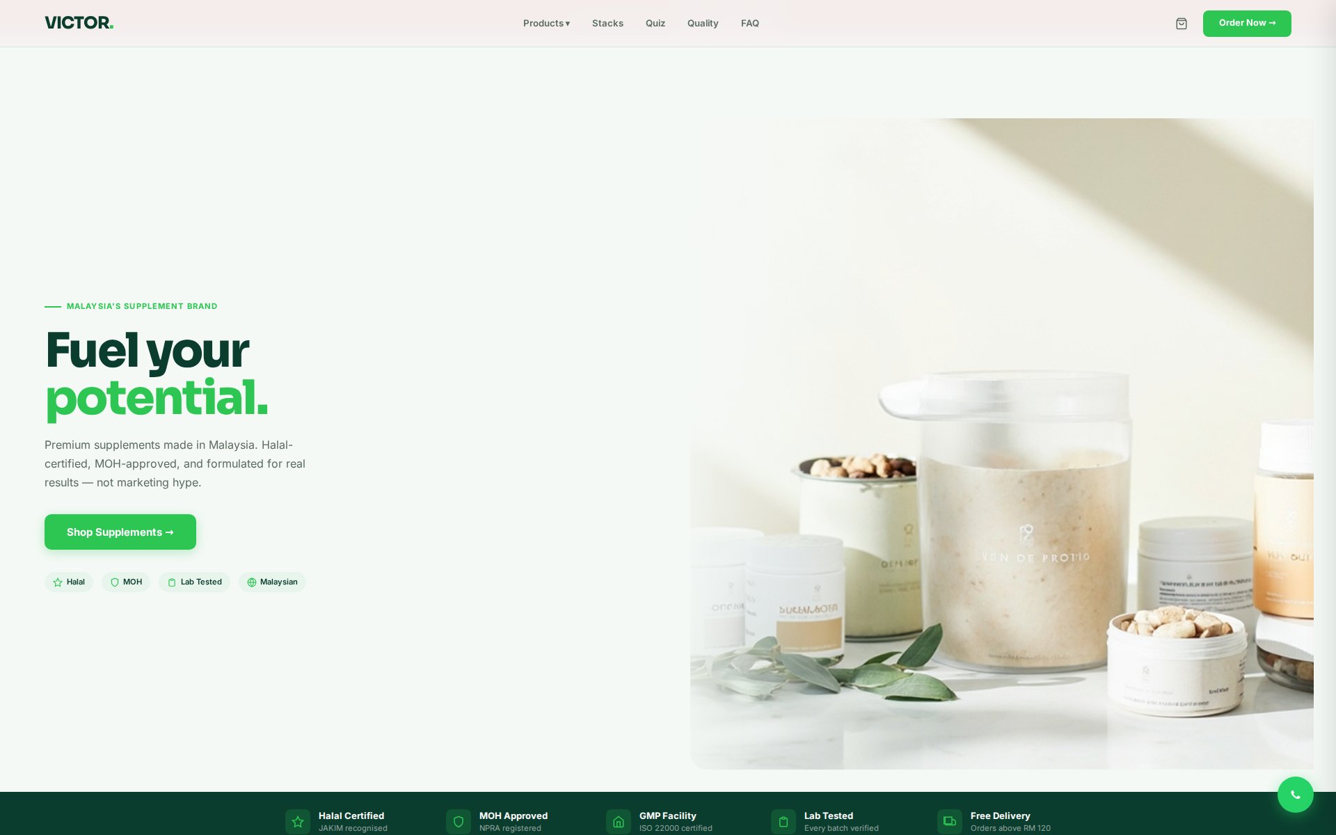
VICTOR
A herbal supplements brand. The brief: feel clinically credible. We did not add a single trust badge.
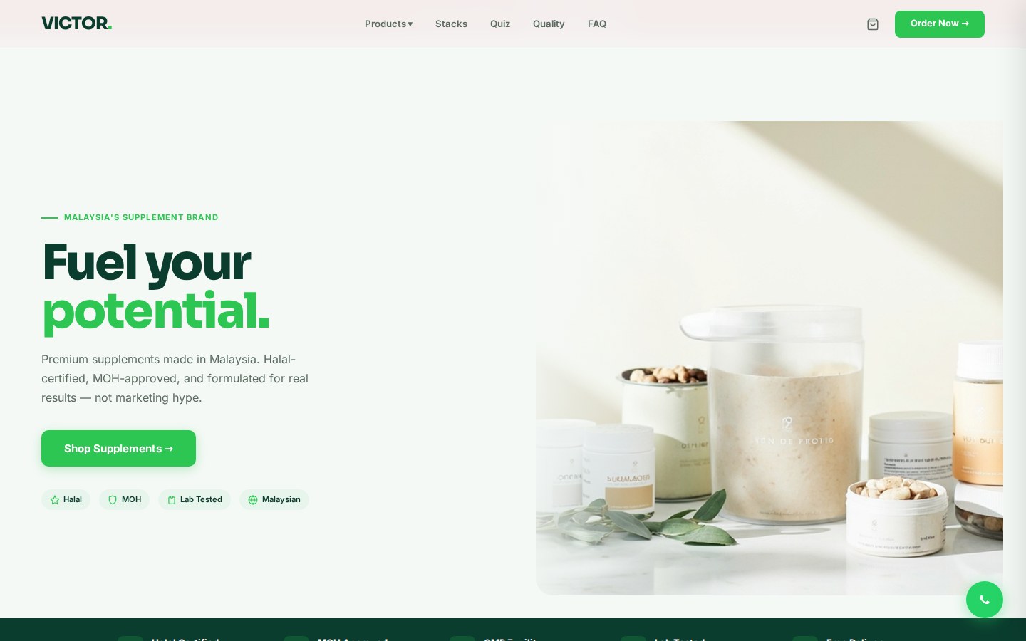
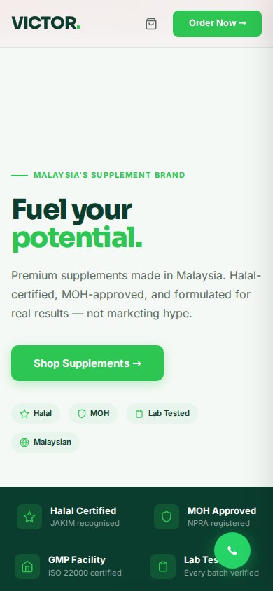
Every other herbal brand adds testimonials, certifications, money-back guarantees, star ratings. The page becomes a wall of credibility claims. The customer is numb to it.
VICTOR removes them. The trust is structural, not declarative. Serif body type, restrained data presentation, sober palette. The page looks like a medical journal, not a marketing site.
2.3xcategory benchmark for supplement ecommerce, MY
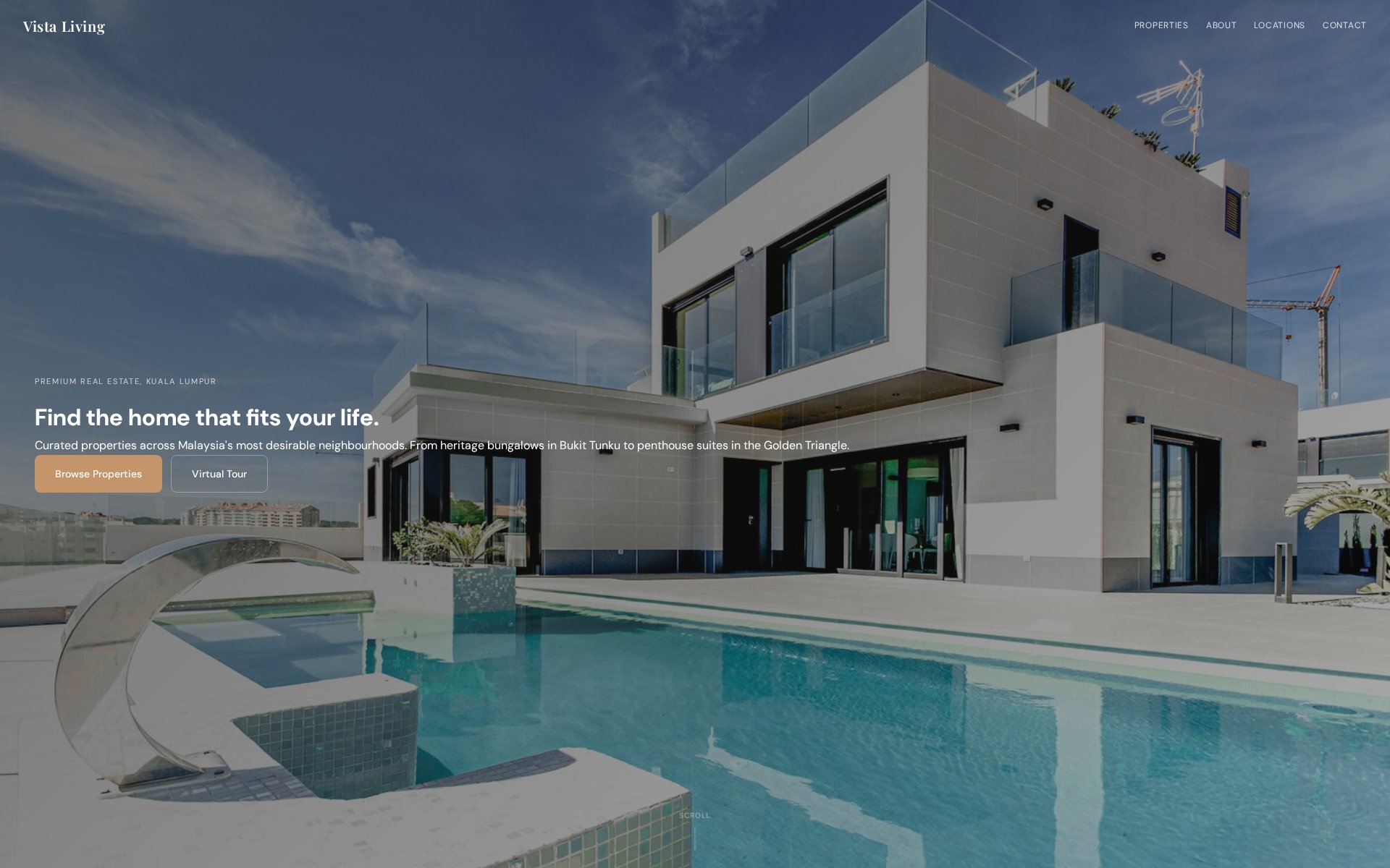
Vista Living
A premium KL property developer. Real estate does not sell with copy. It sells with grid, scale, and photography.
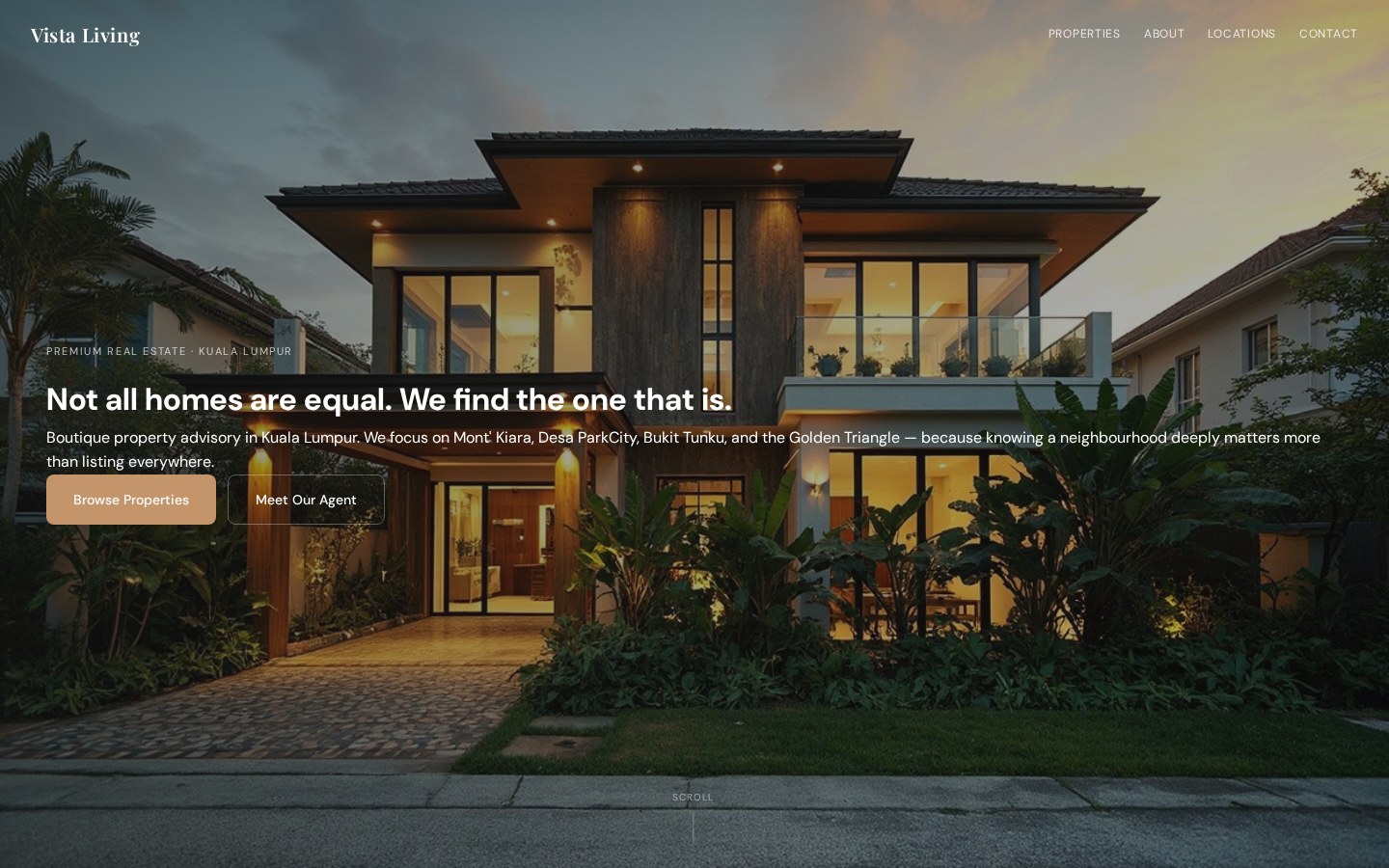
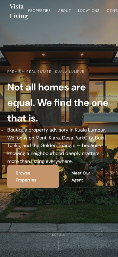
Most property websites are listings. The user is asked to do the work of imagining themselves in the space. Vista Living buyers have seen everything. They will not be impressed by a floor plan.
The hero is the view, not a unit. The grid frames the development as editorial spreads. The site reads like a coffee table book about the development, not a property portal.
+24%pre-launch sales vs. previous campaign, same price point
Nova AI
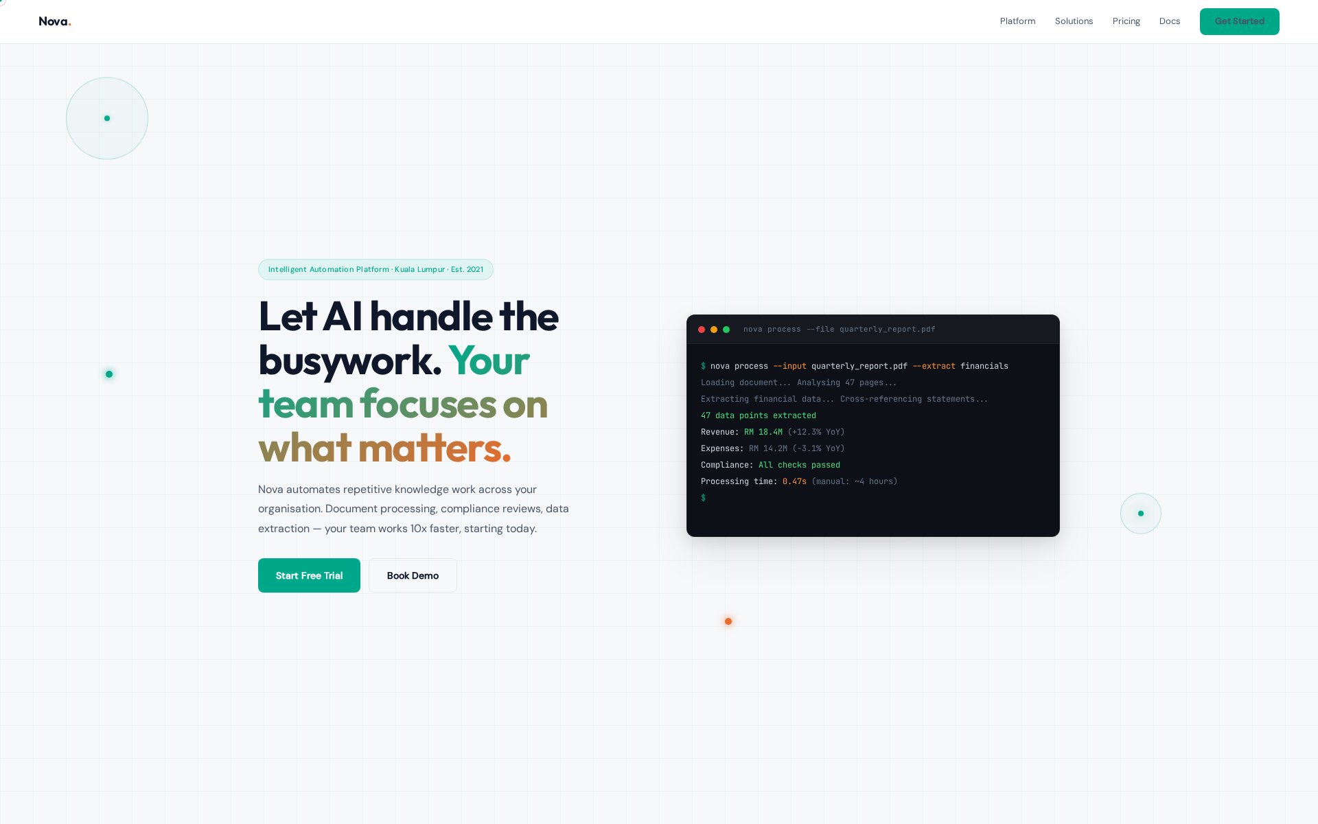
An intelligent automation platform. Could have looked like every dashboard. We built one that looks like a magazine.
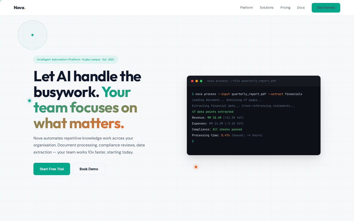
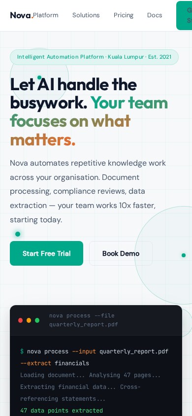
A sophisticated product should not be sold with the visual language of a Temu discount page. Restraint reads as competence. The buyer is paying for trust, not for excitement.
Editorial spacing, generous type, product screenshots in clean white frames. The page is the opposite of AI-themed chrome. Time on page is 4.7x the category average for AI platforms.
Sophistication reads as confidence. Flash reads as compensation.
SCS
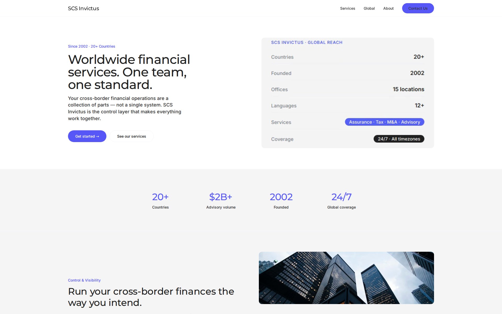
A professional services firm. The default for the category is to look like a bank. We made SCS look like a magazine that happens to be about professional services.
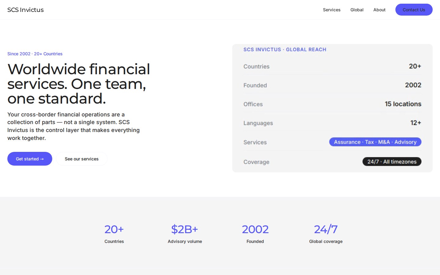
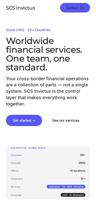
The B2B page looks the same in every category. Inter font, slate blue, stock photography of businesspeople shaking hands, a grid of certifications. The briefs are the same. The pages are the same.
SCS rejects the category visual language. Magazine grid. Confident serif for headlines. Photography of the actual team, not stock. Certifications as a footnote, not a banner.
The category default is the constraint. The opportunity is the deviation.
What we will not do, and why.
Every studio has a list of things they say no to. If you are looking for any of these, we are not the right shop.
No template resale
We design for briefs. If your goal is a 50 dollar template, we are the wrong conversation.
No two-week ship
Compressed timelines produce compressed work. We will not skip the work to win the date.
No cheapest option
There is always someone cheaper in Malaysia. We compete on the argument, not the invoice.
No work without strategy
If you do not know your customer, we can help — but discovery costs more than execution.
No SEO lies
No agency can guarantee page-one Google rankings. We will not sell you that. We will sell you a site that ranks.
If you have read this far, you might be a good fit.
Discovery call is free. We will talk about your business, your brief, and whether we are the right studio. No commitment. No sales pressure.